Wedding Colour Palette Guide: Seasonal Colours for New Zealand Weddings
Choosing a wedding colour palette is one of the simplest ways to create a celebration that feels consistent, personal and beautifully considered. Your colours influence flowers, bridesmaid dresses, invitations, table settings, signage, cake design and jewellery.
For New Zealand couples, the season can also guide practical styling choices. In New Zealand, summer runs from December to February, autumn from March to May, winter from June to August and spring from September to November. Summer suits bright, fresh colours and outdoor settings. Autumn carries warmer tones and richer textures. Winter creates space for deeper shades, candlelight and elegant fabrics, while spring is ideal for playful colour and garden-inspired details.
A balanced wedding palette usually includes a dominant shade, two supporting colours, a lighter neutral and an accent. This gives your florist, venue stylist, stationery designer and bridal party a clear direction without making every element look identical.
Below are four distinctive seasonal wedding colour palettes designed for New Zealand weddings.
Summer Wedding Colours: Berry Garden
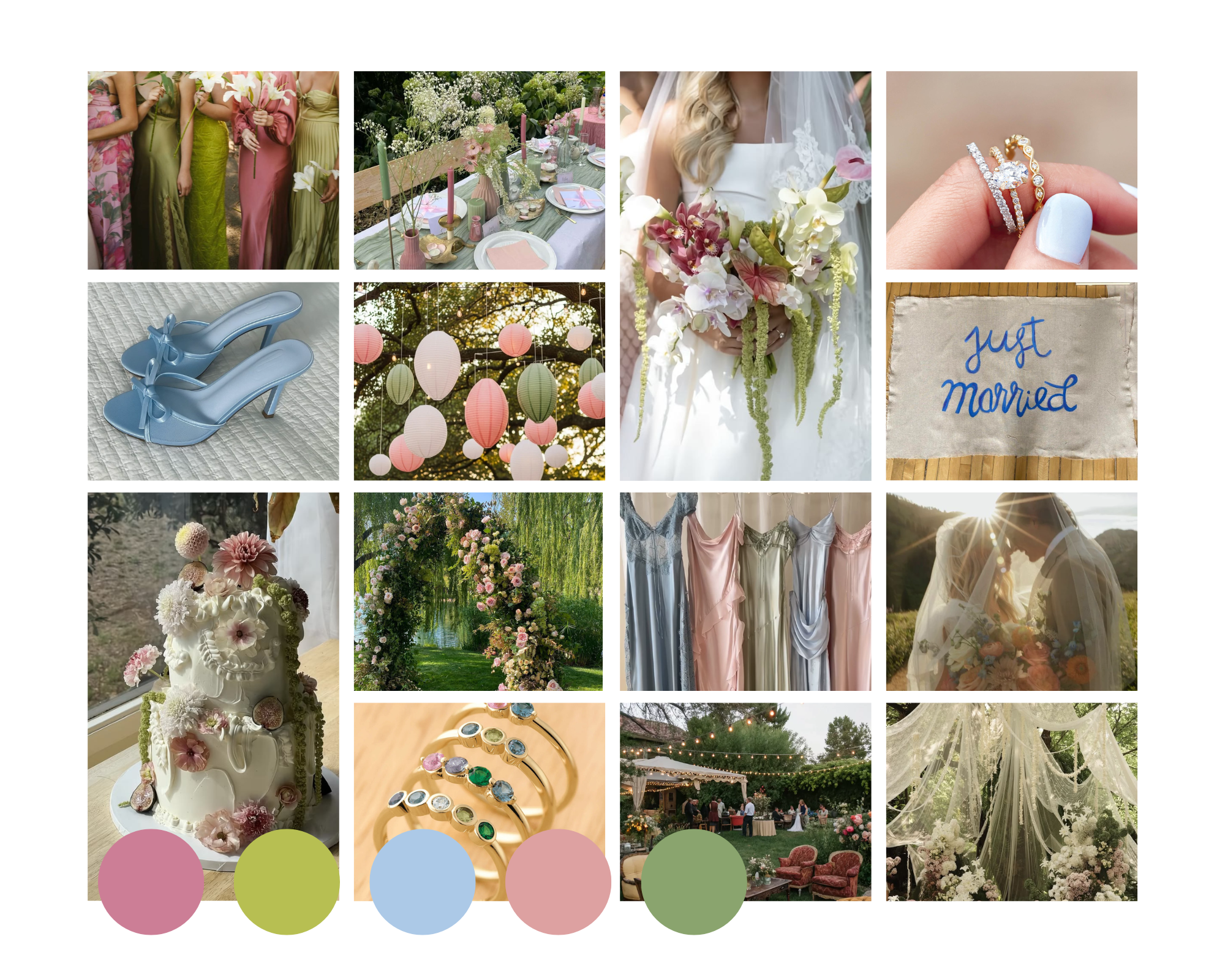
Palette: berry pink, chartreuse, sky blue, dusty rose and sage green
A Berry Garden wedding is bright, fresh and modern without becoming overwhelming. Berry pink brings energy, dusty rose adds softness and chartreuse gives the scheme a lively botanical accent. Sage green creates balance, while sky blue introduces an airy note that works beautifully beneath clear summer skies.
This palette suits garden weddings, vineyards, coastal venues, modern marquees and relaxed outdoor receptions.
Summer Styling, Flowers and Fashion
Use sage green or a soft neutral as the base for table linen, then add berry pink and dusty rose through flowers, candles or napkins. Sky-blue glassware, stationery or ribbon brings cool contrast. Use chartreuse selectively through foliage, fruit, menus or small décor details.
Summer bouquets may combine roses, dahlias, hydrangeas, delphiniums, lisianthus and seasonal greenery. Berry-toned flowers can anchor the arrangement, while pale blue blooms and dusty pink petals soften it. Ask your florist to work to the colour palette rather than one exact flower variety, as seasonal availability can vary.
Bridesmaids could wear a coordinated mix of dusty rose, sage and sky blue. Grooms and groomsmen can choose light grey, beige or soft navy suits.
Platinum and white gold create a crisp finish beside blue and green, while rose gold complements berry pink and dusty rose. Pink sapphire, blue sapphire or green tourmaline jewellery can add a personal connection to the wedding colours.
Autumn Wedding Colours: Harvest Jewel
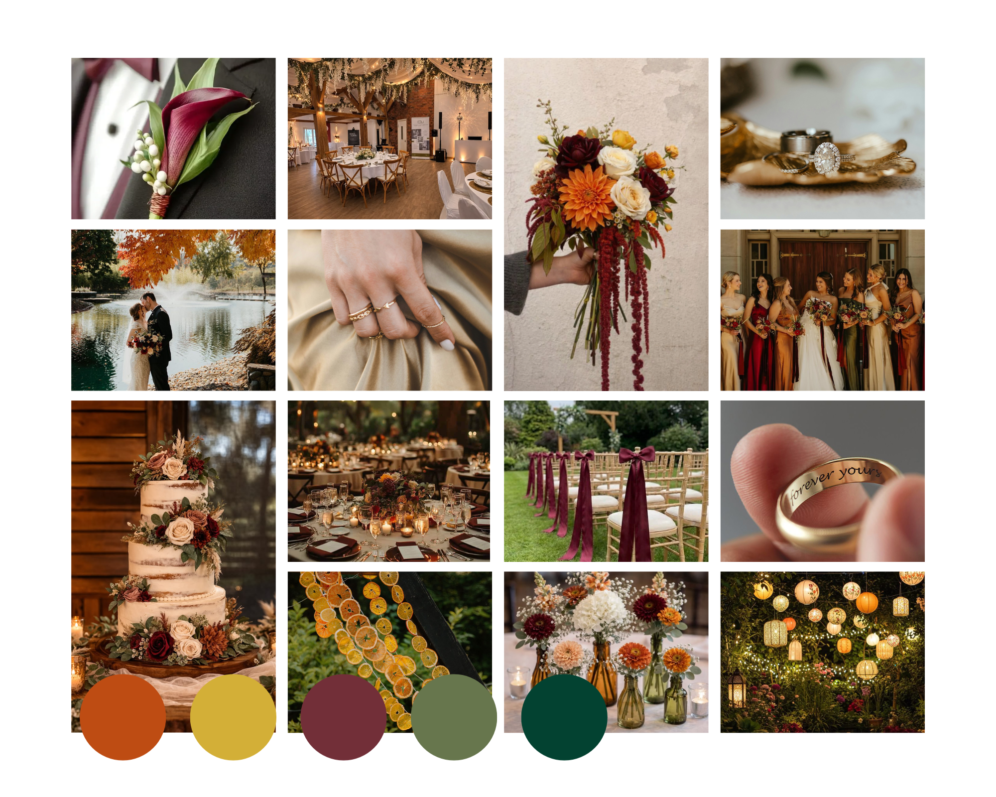
Palette: terracotta, gold, burgundy, fern green and emerald green
Harvest Jewel combines autumn warmth with the depth of classic gemstone colours. Terracotta and gold create a welcoming base, burgundy adds romance, fern green connects the palette to the New Zealand landscape and emerald green gives it a polished finish.
This combination works particularly well in vineyards, country estates, heritage buildings, restaurants and timber-lined venues.
Autumn Styling, Flowers and Fashion
Begin with terracotta, warm ivory or natural linen, then layer in burgundy and green. Emerald napkins, fern-coloured stationery or deep green candles add depth. Gold works best as a finishing accent through cutlery, candleholders, frames, foil printing or jewellery.
Velvet ribbon, linen, handmade paper, dark timber and brushed metal will make the palette feel warm and tactile.
Dahlias, roses, chrysanthemums, orchids and amaranthus suit the theme. Burgundy blooms can be paired with terracotta flowers, fern leaves and glossy emerald foliage. Seed heads, berries or dried elements add texture when used sparingly.
Bridesmaids can wear burgundy, emerald or terracotta, either in one shade or as a carefully balanced mix. Grooms and groomsmen can choose charcoal, dark brown, deep green or navy suits.
Yellow gold is a natural match for this palette, while emeralds, rubies and warm-toned sapphires can echo the colours of the day. A custom wedding ring may also include a hidden gemstone, engraved message or meaningful design detail.
Winter Wedding Colours: Midnight Champagne
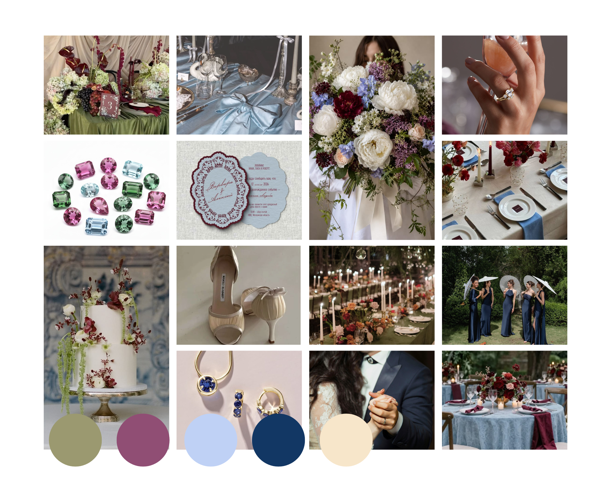
Palette: olive green, plum, periwinkle, navy and champagne
Midnight Champagne is a sophisticated winter palette with more colour than a traditional black, white and metallic scheme. Navy provides a strong foundation, plum adds richness, and olive green brings warmth. Periwinkle lightens the palette with a cool blue-violet note, while champagne adds softness and understated luxury.
The theme suits city venues, dramatic hotels, alpine lodges, heritage spaces and candlelit restaurants, especially for late-afternoon ceremonies and evening receptions.
Winter Styling, Flowers and Fashion
Use navy or olive for the main visual anchors, then add plum through flowers, velvet ribbon, menus or candles. Periwinkle can appear in stationery, napkins or bridesmaid dresses. Champagne acts as the neutral and metallic bridge between the darker shades.
Layer velvet, satin, wool, textured paper, glass and brushed metal to give the room warmth and dimension. Champagne candleholders, soft lighting and reflective glassware will lift the deeper colours without making the setting feel overly formal.
Winter arrangements can feature roses, hellebores, orchids and seasonal foliage. Plum flowers create depth, while periwinkle or pale blue details prevent the arrangement from feeling heavy. Olive branches, eucalyptus and dark foliage reinforce the green tones.
Bridesmaids can wear navy, plum or periwinkle in velvet, satin or crepe. Grooms and groomsmen may choose navy or charcoal tailoring with champagne ties or olive pocket squares.
Platinum and white gold look sharp against navy and periwinkle, while yellow gold adds warmth beside olive and champagne. Sapphire, amethyst, spinel or tourmaline can give bridal jewellery a distinctive winter character.
Spring Wedding Colours: Citrus Blossom
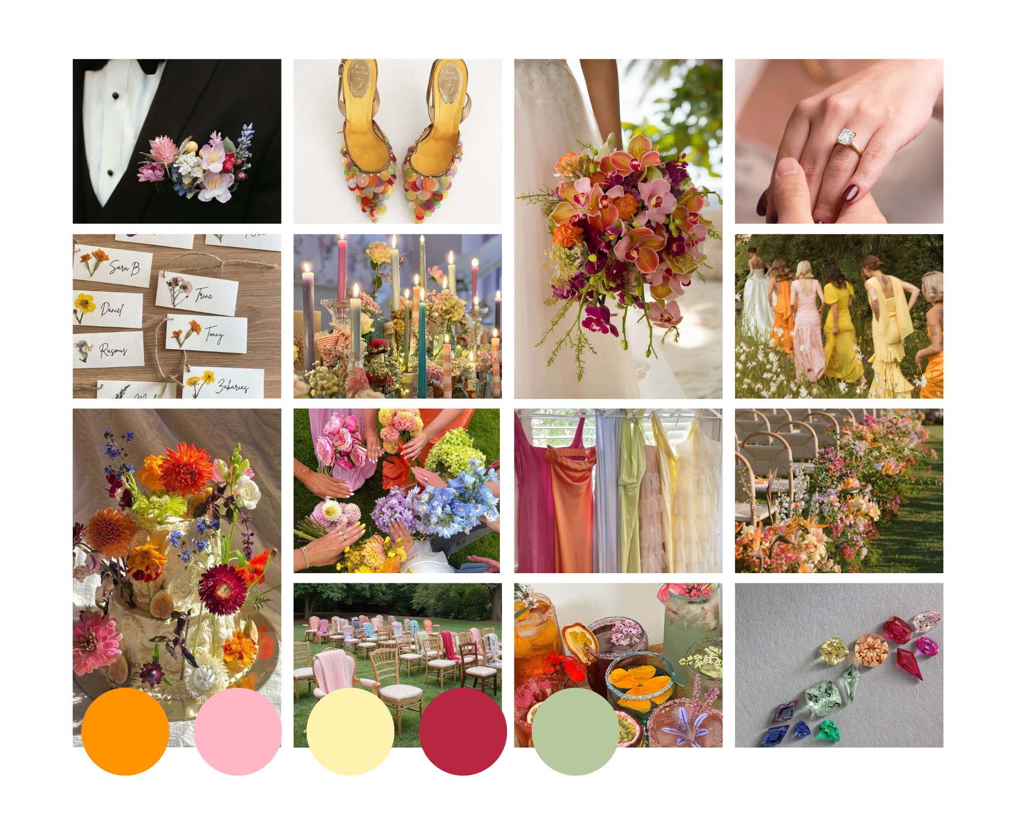
Palette: tangerine, blush pink, butter yellow, raspberry and pistachio green
Citrus Blossom is cheerful, romantic and full of movement. Blush pink provides a soft base, raspberry adds depth, butter yellow brings warmth and pistachio green keeps the palette fresh. Tangerine supplies an energetic accent.
This theme works well for garden ceremonies, glasshouses, orchards, marquees and light-filled urban venues.
Spring Styling, Flowers and Fashion
Use blush or warm white as the foundation, then layer butter yellow and pistachio through linen, candles and stationery. Raspberry can define focal points such as ceremony flowers, a seating chart or bridal party outfits. Place tangerine deliberately in ribbons, feature flowers, menus or smaller table details.
Tulips, ranunculus, roses, sweet peas, poppies and freesias can create a lively mix of pink, yellow and orange. Pistachio foliage and soft green stems prevent the brighter shades from becoming too sweet.
Bridesmaids can wear blush, butter yellow or pistachio, with raspberry or tangerine reserved for a statement look or accessories. Grooms and groomsmen can wear beige, light grey, soft navy or green.
Rose gold and yellow gold complement the warmer shades, while diamonds keep the overall look bright and timeless. Pink sapphires, yellow sapphires, rubies or green gemstones can also be included in custom jewellery.
How to Choose the Right Wedding Colour Palette
Start with your venue, season and preferred atmosphere. A venue with strong colours, landscaping or distinctive architecture may already suggest certain tones. Next, decide which colour will appear most often, which shades will support it and which colour will be used only as an accent.
Compare physical samples in natural and evening light. Fabric, flowers, printed paper and colours viewed on a screen can all look slightly different. Sharing a simple colour reference sheet with your florist, venue stylist and other wedding suppliers will help keep the final look consistent.
Your colours do not need to match every detail exactly. A successful palette allows variation in tone, texture and material. The aim is visual harmony rather than perfect duplication.
Consider how the colours will appear across the main elements of your wedding:
- Ceremony and reception flowers
- Bridesmaid dresses and suits
- Invitations and wedding stationery
- Table linen, candles and glassware
- Wedding cake and desserts
- Signage and seating plans
- Jewellery and accessories
Repeating each key colour two or three times across the celebration will make the palette feel intentional without making the styling overly coordinated.
Coordinate Your Wedding Jewellery with Your Style
Wedding jewellery should complement your personal style first, but your palette can help guide the final details. Platinum and white gold often suit cool, crisp schemes, while yellow and rose gold add warmth to earthy, pink or golden palettes.
Diamonds work across every season and colour scheme. However, coloured gemstones can provide a meaningful link to your flowers, attire, birthstone or personal story.
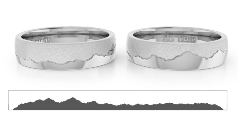
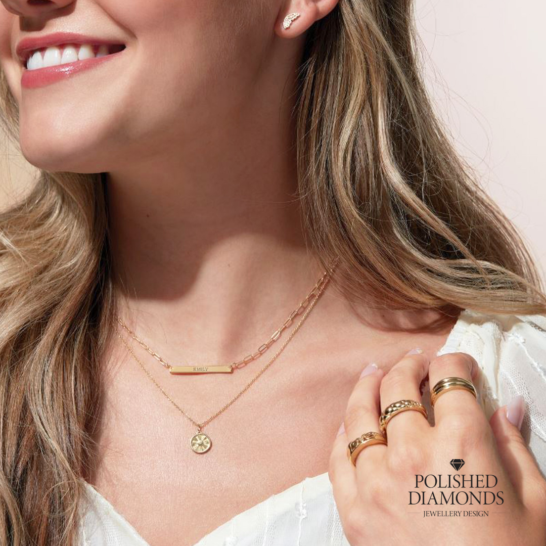
Polished Diamonds designs custom engagement rings, wedding rings and gemstone jewellery in New Zealand. Rings can be tailored through metal choice, diamond or gemstone selection, setting style, engraving and hidden details. This connects your jewellery with the wedding while keeping it timeless for everyday wear.
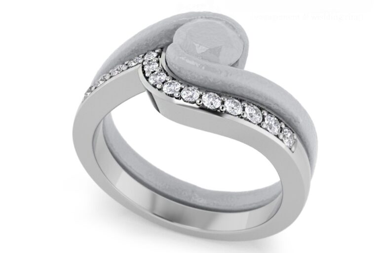
Couples can also consider how their engagement ring and wedding band will look together. Designing the rings as a set can create a comfortable fit and a balanced appearance, particularly when the engagement ring has a low, curved or detailed setting.
Create a Wedding Style That Feels Like You
Seasonal inspiration is a useful starting point, but the strongest wedding style reflects the people being celebrated. Choose colours that suit your venue, clothing and personality, then repeat them thoughtfully across the day.
Whether your wedding is bright and botanical, warm and jewel-toned, moody and elegant or playful and floral, a clear colour palette will help every detail feel connected.
Frequently Asked Questions About Wedding Colours
Most wedding palettes work well with three to five colours. Choose one dominant colour, two supporting shades and one or two accents or neutrals. This provides enough variety without making the styling feel disconnected.
They do not have to. However, seasonal colours can make flowers, fabrics and venue styling easier to coordinate. The most important factor is choosing shades that suit the couple, venue and atmosphere of the celebration.
No. Mismatched dresses can look cohesive when they share a similar tone, fabric weight or colour family. Provide clear colour samples so the final selection looks intentional rather than accidental.
Yes. Coloured gemstones can be used in engagement rings, wedding rings, earrings, pendants or hidden setting details. A custom design can incorporate a wedding colour, birthstone or gemstone with personal meaning.
An engagement ring does not need to match the wedding colours. It should reflect your long-term style and be suitable for everyday wear. Smaller details, such as a coloured gemstone, engraving or metal choice, can connect it subtly to the celebration.
WEDDING COLOUR PALETTE GUIDE: Key Takeaways
- A wedding colour palette enhances personal and cohesive celebration details.
- New Zealand seasons impact colour choices: summer favours bright shades, autumn showcases warmth, winter suits deep tones, and spring inspires playfulness.
- Each seasonal palette includes a dominant shade, supporting colours, neutrals, and accents for balance.
- Choosing the right colours requires considering the venue, natural light, and visual harmony.
- Wedding jewellery should complement personal style, with coloured gemstones connecting deeply to the wedding’s theme.